Expert Insights from the DHP Boxes Editorial Team | Updated April 2026
For brand owners and procurement officers, there is few moments more stressful than opening a shipment of custom-made packaging only to find that the vibrant hue you approved on your MacBook Pro looks dull, dark, or "off" on the physical box. In the world of high-end retail, color is not just an aesthetic choice; it is a subconscious signal of quality, heritage, and reliability.
While digital designs offer infinite possibilities, the transition from a backlit screen colors to a physical substrate—such as the premium cardstock used at DHP Boxes—is governed by complex physics. Understanding the "Why" behind this discrepancy is the first step in protecting your brand's integrity and avoiding costly production delays.

Visualizing the "Gamut Gap": Why backlit pixels (RGB) always appear more vibrant than physical ink (CMYK).
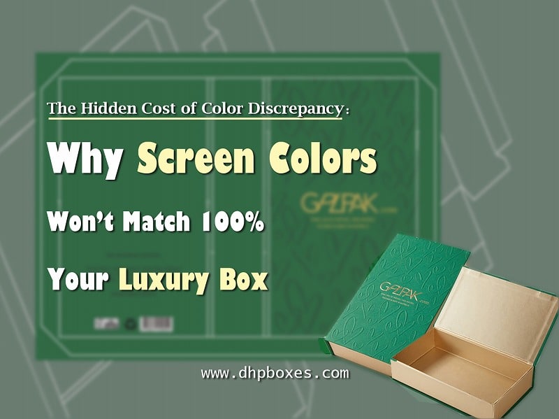
Screen Colors vs. Actual Print Results
The fundamental reason for color mismatch lies in how your eyes receive light. Computers, tablets, and smartphones use RGB (Red, Green, Blue). This is an additive color model where light is projected directly from the screen. Because the screen is backlit, screen colors appear more luminous and saturated than anything possible in the physical world.
Printing, however, utilizes CMYK (Cyan, Magenta, Yellow, Key/Black). This is a subtractive color model. You don't see light coming from the box; you see light reflecting off the ink. The "gamut" (range of colors) for CMYK is significantly smaller than RGB. Deep, neon purples or electric blues often "die" when converted to ink because the physical pigments simply cannot replicate the intensity of a light-emitting diode (LED).

Precision matching: Using physical Pantone swatches to ensure zero-drift color production.
How Substrates and Textures Alter Ink Behavior
As a leading handmade packaging box manufacturer, we often explain to clients that the material is just as important as the ink. The same ink will look different on three different surfaces:
- Coated Paper: Ink sits on the surface, appearing vibrant and sharp.
- Uncoated/Recycled Paper: Ink is absorbed into the fibers, which "mutes" the color and shifts the hue toward the paper's base tone.
- Specialty Textures: Embossed or linen-textured papers create micro-shadows that can make a color appear darker than it actually is.
This is why digital mockups are only 50% of the story. The interaction between the ink and the substrate requires the hand-eye coordination of an experienced craftsman.
Professional Solutions: The DHP Quality Standard
To bridge the gap between your screen colors and your final luxury box, DHP Boxes employs a rigorous multi-step color management protocol:
1. Pantone Matching System (PMS): We don't guess. By using standardized Pantone formulas, we ensure that your brand's "Signature Red" remains identical across every production run, regardless of where your designer is located.
2. Physical Proofing: We strongly advocate for physical "press proofs" over digital PDFs for high-stakes projects. Seeing the ink on your specific chosen paper is the only 100% accurate way to approve color.
3. Advanced Color Calibration: Our factory utilizes precision spectrophotometers to measure the wavelength of reflected light, ensuring every batch stays within a strict "Delta E" tolerance—the scientific measure of color difference.
Ready to eliminate color guesswork?
Consult Our Color Experts at DHP Factory