Table of Contents
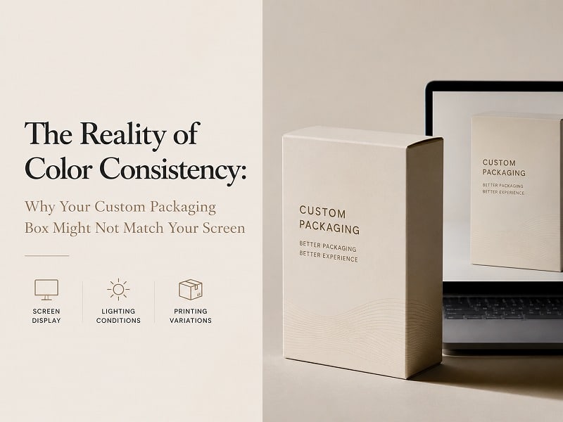
In the world of high-end manufacturing, "What you see is what you get" is often a digital illusion. For brand managers and procurement officers, opening a shipment of a new custom packaging box only to find the "Royal Blue" looks more like "Navy" can be a catastrophic setback. This discrepancy isn’t usually a manufacturing error; it is a fundamental scientific reality involving light, ink, and material absorption.

The Physics of Light vs. Pigment (RGB vs. CMYK)
Your computer monitor operates on the RGB (Red, Green, Blue) model, which is additive. It creates colors by emitting light directly into your eyes. Consequently, digital designs often possess a vibrancy and backlit glow that physical pigments simply cannot replicate.
Conversely, the printing of a custom packaging box relies on the CMYK (Cyan, Magenta, Yellow, Black) model. This is a subtractive process where ink absorbs specific wavelengths of light. When you translate a glowing digital file into physical ink, a "color shift" is inevitable. To mitigate this, expert manufacturers prioritize Pantone (PMS) matching, which uses pre-mixed formulas to ensure global consistency across different production runs.
How Substrates Swallow Your Brand Identity
The material of your custom packaging box acts as the "base" for all color. A "Solid Coated" paper reflects light efficiently, resulting in crisp, vibrant hues. However, if you choose an "Uncoated" or textured handmade paper, the fibers absorb more ink, leading to a more muted, darker appearance.
Furthermore, the lighting environment—whether it's the warm glow of a retail shelf or the harsh fluorescent light of a warehouse—changes how the human eye perceives the finished product. This is why professional factories utilize standardized light sources like D50 (5000K) or D65 (6500K) during the final quality check.

Expert Perspectives: Top 5 Industry Standards
To provide a comprehensive view of how the industry handles color fidelity, we have analyzed five leading perspectives on color consistency in packaging:
1. The Technical Foundation of Color Gamuts
Source: packmojo.com/help/screen-colors-vs-print-colors/
This resource highlights the fundamental gamut limitations. Because RGB can display a wider range of bright, neon-like colors than CMYK can print, many "on-screen" colors are technically impossible to achieve with standard inks. Understanding this "out-of-gamut" reality is the first step for any designer working on a custom packaging box.
2. The Brightness Mismatch & Environmental Factors
Source: centexprinting.com/why-your-printed-colors-dont-match-your-screen-rgb-vs-cmyk/
This insight focuses on the "idealized" version of color. Most modern screens are set to a brightness level far higher than what physical paper can reflect. It emphasizes that a print viewed under office lighting may look different than the same piece viewed in natural sunlight, making the viewing environment as critical as the ink itself.
3. Delta E and Acceptable Color Tolerance
Source: soonpak.com/colors-on-screen-vs-print-why-your-packaging-design-looks-different/
Professional manufacturing utilizes a measurement called "Delta E" to quantify color difference. A Delta E of 1–3 is generally considered invisible to the untrained eye. This perspective underscores that 100% perfection is a myth; instead, the goal is "commercial matching" through physical proofs and standardized sign-offs.
4. Brand Protection Through Pantone Precision
Source: gentlever.com/pantone-color-for-custom-box-packaging-design/
For luxury brands, consistency is synonymous with trust. This guide explores why high-end rigid boxes must utilize the Pantone Matching System (PMS). By using unique codes, a brand’s signature color remains identical whether the custom packaging box is produced today or a year from now.
5. DHP Boxes: The Artisan Approach to Color Integrity
Source: www.dhpboxes.com
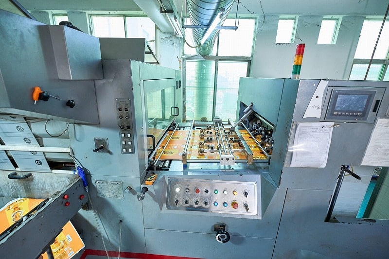
As a leading handmade packaging factory, DHP Boxes bridges the gap between digital design and physical reality through a rigorous, three-tier verification process. Unlike automated mass-production facilities, DHP emphasizes the human element of "跟色" (Color Following). By utilizing professional D50/D65 light booths and providing physical press proofs before bulk production, DHP ensures that every custom packaging box aligns with the client’s vision, accounting for the unique absorption rates of luxury handmade papers and specialty finishes.
DHP Factory’s Approach to Color Mastery
At DHP Boxes, we believe that transparency is the best quality control. We advise our clients that digital mockups are for layout approval, while physical samples are for color approval. Our factory specializes in custom rigid boxes where the interplay of texture and tone is complex.
Our technical team assesses the "Solid Coated" vs "Solid Uncoated" effects on your specific custom packaging box design to prevent surprises. By managing the "Delta E" variance and adhering to international ICC standards, we ensure your brand maintains its premium status across every shipment.
Conclusion: Bridging the Digital-Physical Divide
Color consistency is not just a matter of "pressing print." It is a delicate balance of science, material selection, and lighting standards. To ensure your next custom packaging box project meets your expectations, always demand a physical proof and consult with experts who understand the nuances of the CMYK transition.
Ready to ensure your brand colors are perfect?
Contact the DHP technical team today for a professional consultation on your next luxury packaging project.
Request a Custom Quote & Color Sample